
Reports, Proposals, and Large-Format Layouts
While I was a full-time employee of Jones & Jones (1999 to 2009) I had occasion to do the layouts of a decent stack of reports and above-average-content proposals. I’ve assembled here an array of some of the most significant ones, but there are plenty of others I could show. These, for the most part, are worth inclusion here because of their design or production circumstances. Any astute observer will note that these examples are pretty spartan…very few full-bleed products among them; that’s a consequence of the standard “house style” at Jones & Jones, mostly, but also a reflection of the need to keep the layout clean so such masses of informational content can be read and digested without the reader having to fight through design affectations to even see the content. There’s certainly a time and a place for richly graphic layouts, but most of these weren’t in that category. Something these examples can only hint at showing is the sheer amount of text content that it was my responsibility to organize both visually and hierarchically: I’ve always been a strong user of document styles in both PageMaker and InDesign, which made HTML stylesheets an easy technique to learn when those came into play for web design.
Something I discovered as a result of doing some of these layouts is that I love to produce multilingual layouts. At the time of these examples I was only able to import the bulk of such non-English text as .TIF or .PDF graphics, but since then I’ve taught myself to type in Hangul, Arabic, and other alphabets. (I was already nearly English-speed as a French typist as well as being quite fast in Greek and capable in a few other languages.) So if you’re looking for a design/layout person who can work in multiple languages without getting flustered, email me—illico—at this domain!

Anchorage Folk Festival 2025 and 2026 Programs
8.5" x 5.5" booklet, 68 pages (InDesign)
December 2024–January 2025 and December 2025–January 2026 | client: Anchorage Folk Festival
I was asked to take on this layout from a longtime festival partner who wanted to retire from the task, and I inherited her basic design for the program but had discretion to develop it further as I saw fit. Toward that end, I added a welcoming introduction that spelled out the vast scope of the festival’s 11 days of nearly all free workshops, performance sets, jams, concerts, and other activities—something probably known to people who’ve attended the festival for decades but bewilderingly unclear to anyone new to it. I worked closely with a team of about 10 Board of Directors members and major volunteers in charge of scheduling and raffle/silent auction aspects, including two-hour teleconferences with the Board each Monday for three months in order to be fully informed and keep all of the many moving parts of the process well organized and on track for a tight print deadline (including processing ads from approximately 40 sponsors and designing them myself when necessary). In addition, I was hired by a Board member to coproduce with her a series of monthly emailed newsletters (in Constant Contact) promoting the festival and the Anchorage Folk Festival’s other events as well as acting in a part-volunteer, part-freelance capacity to update/expand and maintain their website in support of all of this.
My work on the 2025 festival was very much appreciated, and in the latter half of the year I resumed the coproduction of those newsletters in support of the 2026 festival, for which I again produced the program and populated the AFF website with all of its schedules and information to facilitate that turning up in search-engine results which in turn would promote not just the festival’s many events but also its artists, participants, venues, and sponsors in perpetuity. I made some refinements to the 2026 program layout to improve its chronological presentation of the offerings while encouraging, right up front, participation in the 50-some free workshops available over the two last weekends of January.
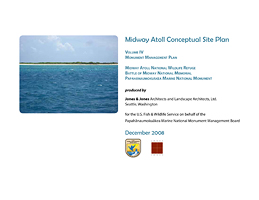
Midway Atoll Conceptual Site Plan
11" x 8.5" report, 86 pages (InDesign CS3)
December 2008 | client: U.S. Fish & Wildlife Service (for Jones & Jones)
As a layout this doesn’t look particularly impressive or atractive, perhaps, but it went through some format changes that ensured we kept it clean and tight. Most significantly, the document was originally slated to be 17" x 11", not 11" x 8.5", and when the client requested the shift to the smaller format (while desiring roughly the same page count and type size) I had quite the challenge on my hands to adapt the layout. In addition, I had to be sure any typeface used included the character “ā” (a letter “a” with a macron) so we could make reference to the project’s location in the Papahānaumokuākea Marine National Monument. The PDF referenced here isn’t the full document, due to file-size constraints (some of the omitted diagrams and maps are complex placed PDFs), but rather shows the gist of the layout. My colleague René Senos and I knew the sheer mass of the text, both in narrative and in tables of data, would make this deathly dull to read cover-to-cover without photographic illustrations to both enliven it and provide ground-level context for people who’ve never been to Midway; thankfully, René had taken a LOT of photos while there so we had an excellent project-specific image bank to draw upon.
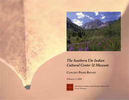
The Southern Ute Indian Cultural Center & Museum—Concept Phase Report
11" x 8.5" report, 22 pages (InDesign CS2)
January 2006 | client: The Southern Ute Indian Tribe (for Jones & Jones)
An organized Project Manager and an efficient team made the three-day turnaround of this layout (from initial document setup to electronic delivery to client) a pleasantly smooth and undramatic process that left us all unruffled despite the tight timeframe (and of course I was working on other projects all the while).

Seoul Grand Park Zoo—Final Master Plan Report / 서울 대공원 동물원—기본계획
8.5" x 11" report (with various 11" x 17" foldouts), 648 (later 703) pages (InDesign CS2)
November 2005 | client: Seoul Grand Park National Zoo (for Jones & Jones)
I was given advance notice of this as being a 400±-page document, mostly text but with a smattering of detailed graphics, that would be coming my way to unify and produce in its final form a week or two hence; what actually happened was that I got almost no time to devote to the prep work after that initial heads-up and then was absolutely slammed with work the week it was due, when three coworkers whose work overlaps with mine were all out unexpectedly for medical reasons. The ensuing mess, as I covered for their work as well as doing my own, became a 5-day, 56-hour week from southwest of Hell, and this document burgeoned into a 648-page, bilingual English/Korean challenge…a challenge for my computer and software as well as for myself, and one I took from barely-begun to finished in a hectic 3-day span.
Given that the nature of documents being compiled in this report ranged from Word and Excel files (the bulk of it) to Photoshop and Acrobat files (and one PowerPoint presentation that gave me no end of trouble), I decided almost immediately that only Adobe InDesign could handle the load (and this was before I had a clear idea of how demanding that load would be). I had upgraded to Adobe’s Creative Suite 2 (Premium Edition) late that summer and had been exploring its interworkings ever since, but this was the first real test I’d put it to…and it came through with flying colors, thankfully. The most useful aspect of CS2 in this nightmare was the powerful support of the Acrobat PDF file format across programs and across platforms: any Word file that was more than just text, and every Excel file, got ripped as a PDF and placed in the InDesign document, with not one hiccup or glitch *ever.* (Well, O.K., maybe one technicality that came up at the very end: finding that Comments included as markup in a PDF can’t be included in the viewable/printable PDF when placed in an InDesign file, but those markups were a workaround in the first place and not intended to be tested like this.)
Because of the proprietary nature of this report, I can’t show more than the first part here; this suits me just fine, however, because really this narrative is more of a product plug for Adobe than a claim to any design work (what little there was was risibly dry given the circumstances). Although I should mention that I did a bit of the Korean typing myself in the process, as I taught myself to type Hangul characters that summer after adding Microsoft’s multilingual Office Proofing Tools software to my computer’s arsenal.
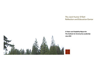
The Jack Hunter O’Dell Reflection and Education Center—Vision Report
14" x 8.5" report, 34 pages (InDesign 2.0.1)
July 2004 | client: The Institute for Community Leadership (for Jones & Jones)
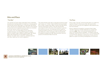
Working in close collaboration with architects Mark Johnson and J Allen Cox, I had sufficient time and inclusion to produce a report that our entire team was really pleased with. The report’s design is much stronger in hard copy than it appears onscreen in the PDF; this is partly because I exploited its 28"-wide “wingspan” to imbue the layout with a feeling of breadth and open sky, and when you have this in your hands it balances very nicely.
The two color sketches were done by local artist Stephanie Bower; with the exception of the “Green Building” page spread, all of the photographs used were taken on-site at the Reflection Center, which helps this report serve as a fundraising tool.

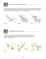
Balboa Park Land Use, Circulation, and Parking Study: Findings & Options White Paper
8.5" x 11" report, 43 pages (PageMaker 6.5)
October 2003 | client: City of San Diego Park & Recreation Department (for Jones & Jones)
This second White Paper produced for Jones & Jones’s Balboa Park study fairly well embodied the style of the design I had created in April for the overall project. The elements I established for the Study included reports, meeting-announcement flyers and postcards, presentation boards, and a website. I also produced all of the conceptual site plans at this stage, alternately in Freehand 10 and Photoshop 7 as the Principal-in-Charge required different effects to be implemented.
The last report we produced for this Study, the “Preliminary Final Draft,” involved a layout of 171 pages; that production was punctuated rudely in its final client-is-waiting deadline hours by PageMaker not only crashing but LOCKING MY LAYOUT SHUT so I couldn’t open it in any form on any platform. I vividly remember that evening and how I sat there staring at the computer monitor, willing my brain to race through EVERY conceivable workaround I might have encountered in 10 years of working with PageMaker, as the Principal-in-Charge paced and fumed, me telling him the whole time “I’ll get it, I’ll find a way. Don’t panic. I’ll get it.” And I DID. Wanna know how? Email me. illico at this domain.

Tropical America Program Document
8.5" x 11" report, 160 pages (PageMaker 6.5)
July 2003 | client: Miami Metrozoo (for Jones & Jones)
This report was the culmination of Jones & Jones’s initial planning phase for the Tropical America (later renamed “Rhythm of the Tropics”) exhibit concept at Miami Metrozoo; I designed the report’s color scheme and wayfinding elements to facilitate easy navigation through the massive content. After the report was delivered to the client, I produced a website version of it which was later transformed into a resource page to show the client Jones & Jones’s current project status and products; the website retained the navigation scheme of the original document.
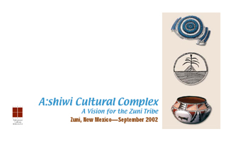
A:shiwi Cultural Complex Vision Report
14" x 8.5" report, 18 pages (PageMaker 6.5)
September 2002 | client: the Zuni Tribe (for Jones & Jones)
Architect Mark Johnson and I developed this report’s design together, tapping the colors of turquoise, adobe, and sky for our palette.
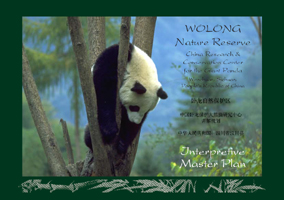
Wolong Nature Reserve: Interpretive Master Plan
??????? ????????????? ???? ???????,??????
A4 (11.69" x 8.26") report, 56 pages (PageMaker 6.5)
September 2002 | client: U.S.–China Environmental Fund / China Research & Conservation Center for the Giant Panda (for Jones & Jones)
Working from another designer’s earlier draft of this report, I sustained and developed the existing style of the report while streamlining the content’s presentation wherever possible; this project had the added novelty of laying out constantly-changing English text and leaving space for Chinese text to be added only when the English text had been finalized.

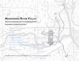
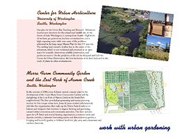
Menomonee River Valley: Natural Landscapes for Living Communities
11" x 8.5" proposal, 54 pages (PageMaker 6.5)
February 2002 | client: the Menomonee River Valley National Design Competition (for Jones & Jones)
I enjoyed creating this proposal very much and am still happy with its design, which was later adapted for use in many other Jones & Jones proposals as an alternative to the dull boilerplate style the company usually uses. Jones & Jones was shortlisted in the competition but did not get the job in the end.

Parque Cesar Chavez: Vision Report
17" x 8.5" report, 18 pages (PageMaker 6.5)
September 2001 | client: Sea Mar Community Health Centers (for Jones & Jones)
Architect Mark Johnson asked me to build this document in its unconventional height/width ratio to give it a strong sense of breadth and open white space; improving on my design of the original proposal, I used the United Farm Workers’ stylized eagle icon as a gentle backdrop for the page spreads in tribute to Chavez’s pioneering role in the UFW’s creation. A simple website was later created using this report’s design.
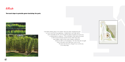
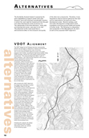
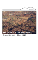
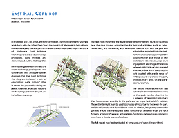
Meadow Creek Parkway: Final Report
11" x 17" report, 34 pages (PageMaker 6.5)
July 2001 | client: Albemarle County, Virginia (for Jones & Jones)
As the bulk of this report was intended to present detailed maps and plans, I was tasked with using large-size layout already established, letting the graphics take precedence throughout in this content-heavy report; my solution was to beef up the navigation to match this scale, making use of the margins as well as letting the hierarchical placement of the text serve as a nagivational aid in itself.
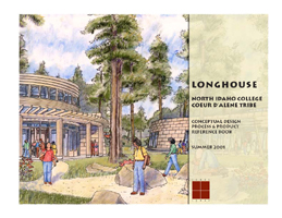
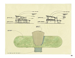
Longhouse: Conceptual Design Process & Product Reference Book
11" x 8.5" report, 48 pages (PageMaker 6.5)
Summer 2001 | client: North Idaho College, Coeur d’Alene Tribe (for Jones & Jones)
Most of the concept plans and sketches in this report were done on yellow tracing paper, so I decided to retain the “still in design” feel this gave the overall report. As the plans were in fact being modified late in the layout process, I had to make many of the architect’s revisions myself in Photoshop to save him having to redraw entire plans, because White-Out doesn’t do much good on yellow paper….
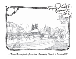
Georgetown Neighborhood Park: Vision Report
11" x 8.5" report, 40 pages (PageMaker 6.5)
October 2001 | client: Georgetown Community Council (for Jones & Jones)
Continuing with the retro design feel of our original proposal for this project, I switched to an almost-all-greyscale format to allow the Council to cheaply reproduce the report for distribution to Georgetown residents.
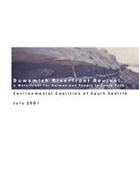
Duwamish Riverfront Revival
8.5" x 11" report, 52 pages (PageMaker 6.5) + 36" x 48" presentation boards (FreeHand)
July 2001 | client: Environmental Coalition of South Seattle (ECOSS) (for Jones & Jones)
In designing this report, Nate Cormier, Mark Johnson, and I adapted the graphic style we’d established for a series of presentation panels used earlier in the project’s development. It’s a pretty tame layout, but I think it turned out reasonably well considering that it was essentially a group effort.

Georgetown Park/P-Patch Project proposal
11" x 8.5" proposal, 18 pages (PageMaker 6.5)
December 2000 | client: Georgetown Community Council (for Jones & Jones)
I had fun with this proposal, but how could I not, given that Seattle’s classic Hat n’ Boots structures were key elements of the project and that the Selection Committee was asking for proposals that reflected Georgetown’s “industrial-artistic-cowboy” style. I was given a free hand to develop a design scheme for the proposal, and the resulting “old postcards of interesting places” motif (with a dash of 1950s cookbooks in the layout and palette) went over very well.
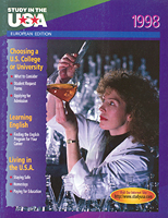
Study in the USA: 1998 European edition layout
Spring 1997 | client: Study in the USA
SUSA is an annual magazine essentially consisting of college-recruitment advertisements accompanied by some general-information articles about how to apply to and attend U.S. colleges. The format changes little from year to year.
I did the layout for the 1998 European edition in 1997 before taking on production-coordination duties for the 1998 layout cycle of this magazine’s seven editions (European, Middle Eastern, Northeast Asian, Southeast Asian, Spanish/Latin American, Japanese, and Summer Study). The bulk of the work on this job’s layout cycle was the preflighting of the ads, which came from colleges all over the U.S., mostly in digital form (PageMaker, QuarkXPress, Illustrator, FreeHand, or Photoshop, but also occasionally Word or, worse, FrontPage or Publisher) but occasionally as camera-ready film or prints.
Comments © 2009 Mark Ellis Walker, except as noted, and no claim is made to source imagery noted.