Posters, Panels, Signs, Boards, Maps, and Plans
My first poster designs date from about 1992—cut-and-paste affairs for a Scott Warrender musical and a nonprofit’s fundraiser, as I recall—but those were truly rustic amateur efforts which I can’t in good conscience feature here among more professional products. Still, there’s a lot to be said for the sheer fun of concocting those slapdash works, and when I’m given the opportunity to run with my own design ideas I can invest the result with a great deal of vitality. I like strong and structured designs in my large-format layouts such as those shown below (which are merely a small sample of my large-format work)—usually constructed to grab the eye with a visual punch that compels closer exploration.
One overall relevant thing I don’t mention in any of the following design notes is that I have a particular love for map-related production—not simply cartography, although that’s certainly one of my interests, but really any mapping. Laying out a site plan for a project (and, ideally, rendering it with color and texture to give it some “life” to engage its viewers more personally) is a joy-and-a-half to me. Wanna see me light up like a Christmas tree? Ask me about the site map of Expo ’74.
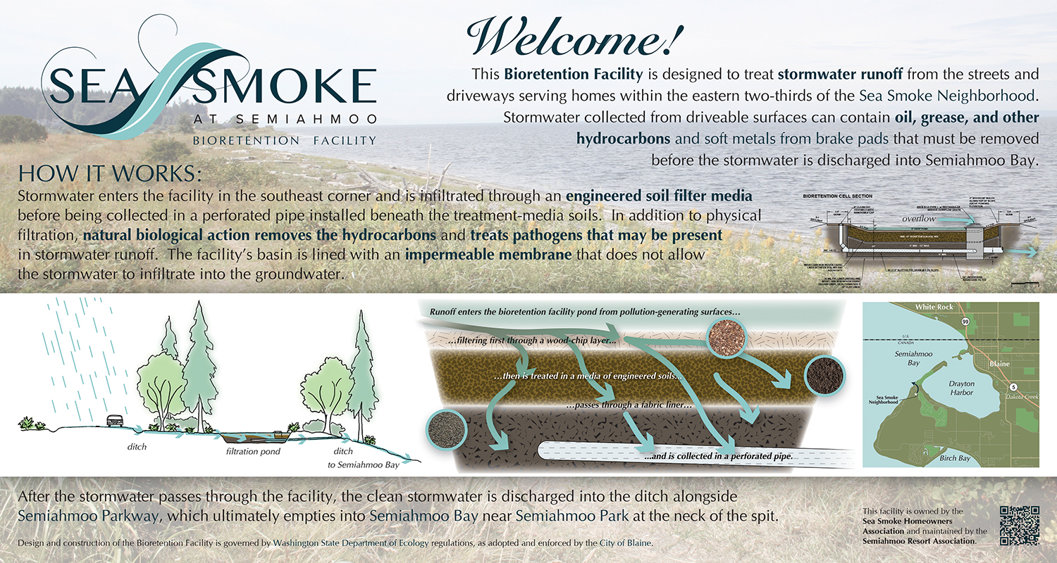
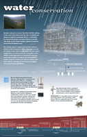
Sea Smoke Bioretention Facility Interpretive Panel
30" x 16" board (Illustrator CS6)
February 2018 | client: Rimland Pacific, on behalf of the Sea Smoke Homeowners Association
Wayne Schwandt of Bellingham-based developers Rimland Pacific, for whom I’d produced a logo and some Google Earth-resident building simulations around 2013, asked me to do a couple of signs in July 2017 and January 2018 to promote their planned-community Sea Smoke Neighborhood project, located on the headland above Semiahmoo Spit. The first was a simple promotional sign featuring a map of the available plats and renderings (not by me) of sample house designs, but the second was a more creative opportunity for me: an interpretive sign illustrating the role of a pond near the site which exists to clean stormwater runoff from the adjacent roads before the water is discharged to Semiahmoo Bay.
What was different for me in this was that I was producing the illustrations myself, whereas on past boards such as the Paynes Prairie boardwalk set (see below) I was generally working with drawings provided by a landscape architect. I’m not an illustrator per se, but working with architects and landscape architects for over 10 years definitely familiarized me with the appropriate styles, and I’m a decent mimic, so I gave it a shot. And I’m happy with the result.
Also, the board presented another illustrative challenge for me, a less crucial one but something that turned out to be an opportunity, in that I knew I wanted a photographic background but initially couldn’t think of what it should be a photograph of. For the board’s content I had been given text, an engineering CAD drawing of the pond’s structure, the Sea Smoke logo, and a photograph of a similar site, but it seemed silly to me to have the background show, say, ferns and trees when the viewer had those all around them, or a biofiltration pond when they were looking right at one beyond the sign. Plus which, if I wanted a relevant site photo, February is a terrible time to get one in the Pacific Northwest unless you’re keen on grim shades of grey.
As I was wrapping up the design, however, I had the bright idea of digging back through photos I had taken during a Semiahmoo Spit site visit about 10 years earlier, ahead of doing some interpretive signage that in the end never got produced, and I was delighted to find among them one that showed not only Semiahmoo Bay but even the headland on which the Sea Smoke site sits. So I was able to provide a view of the destination of the treated stormwater. Nifty!
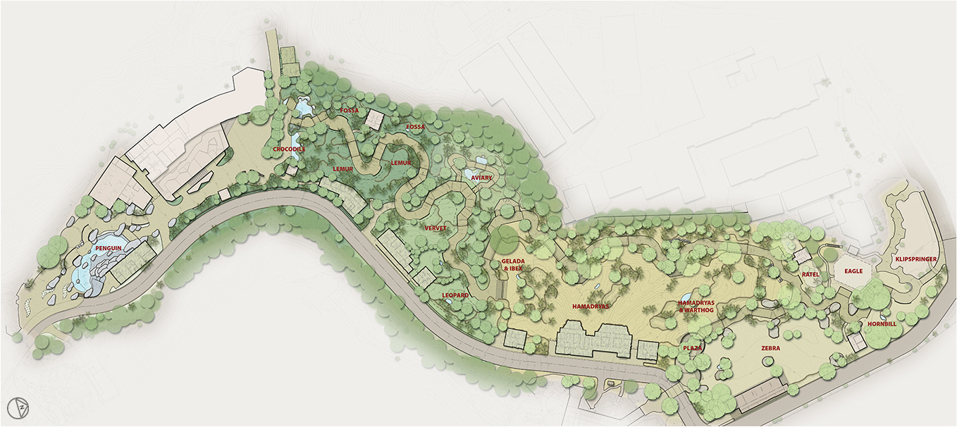
San Diego Zoo—Africa Rocks Concept Plan Rendering
74" x 36" poster (Photoshop CS6)
September 2014 | client: ELM Environments
It was a delight to work again with my former Jones & Jones colleagues Chris Overdorf and Greg Murphy, later at ELM Environments, to produce this rendering of their still-in-progress landscape/habitat design for the upcoming Africa Rocks exhibit area of the San Diego Zoo (in conjunction with Miller Hull and Quince Farm Studio). Their design features a path that winds through four African biomes—tropical forest, savanna scrub, Ethiopian highlands, and acacia woodlands—giving visitors a chance to see leopard, zebra, ibex, a variety of baboons, lemur, hornbill, and other animals in their environments, as well as to pass through aviaries and behind/under waterfalls along the way.
I enjoy projects like this, in part because I’m helping to make “readable” to the non-architectural viewer the design of the exhibit, translating from dry AutoCAD linework to a colorful scenario that gives an idea of the variety of habitats that will be traversed by the visitor. This presentation-quality graphic isn’t intended to be photo-realistic, but rather to present details of the design in a way that could be navigated visually—e.g., exhibit-area borders shown, support buildings more visually present than they would be in the built environment, path edges sharply defined, and stylized tree cover—while still conveying a feel of the visitor’s journey.
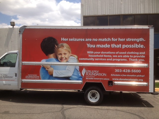
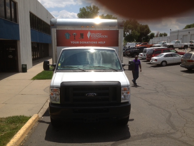
Truck Wrap Graphics
181" x 84" typ. side + rollup door + over-cab attic (InDesign & Photoshop CS3)
May 2012 | client: Savers Inc
In 2012 I provided on-call graphics-production support for Savers Inc (the parent company of Value Village). Early on, they asked if I could do a truck-wrap graphic; I was in the process of completing one for Big Brothers Big Sisters of Puget Sound just then, so I said “sure!” and they provided a couple of photos and a little text for me to implement for the Vietnam Veterans of America (VVA). The design I produced was so well-received at Savers, and by one of their many partnering agencies (nonprofits they support with administrative aid and proceeds from donated goods sold at their stores), that they decided to make that the template for all trucks in their nation-wide donation-center network as new trucks came into use or old ones were due to be repainted. That was flattering but also worrying because what I had designed wasn’t intended as a template! Nevertheless we adapted it to other partners’ trucks—the Epilepsy Foundation of Colorado (shown here), Big Brothers Big Sisters of Central Arizona, and the Multiple Sclerosis Association of America, the EFC truck mercifully being the only one to require working around track bars on the sides in the design.


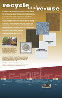
Paynes Prairie Boardwalk Interpretive Panels
5 48" x 15" boards, 2 30" x 15" boards, and 2 32" x 48" boards (InDesign & Photoshop CS3)
January 2012 | client: City of Gainesville, Florida (for Jones & Jones Architects and Landscape Architects, Ltd)
They are for a “welcoming classroom” and seven viewpoints along a boardwalk through a constructed wetlands being created for the City of Gainesville’s Water Department to “clean and polish” wastewater on its way from the city to the sheetflow of Paynes Prairie, south of town. The content of the boards educates the visitor regarding how such natural processing of wastewater works, why it’s done, and how it relates to the wildlife they can see around them (birds, amphibians, and reptiles, and most visibly alligators). I wasn’t involved with the project when the boards finally went to print, but I believe they have been installed now.
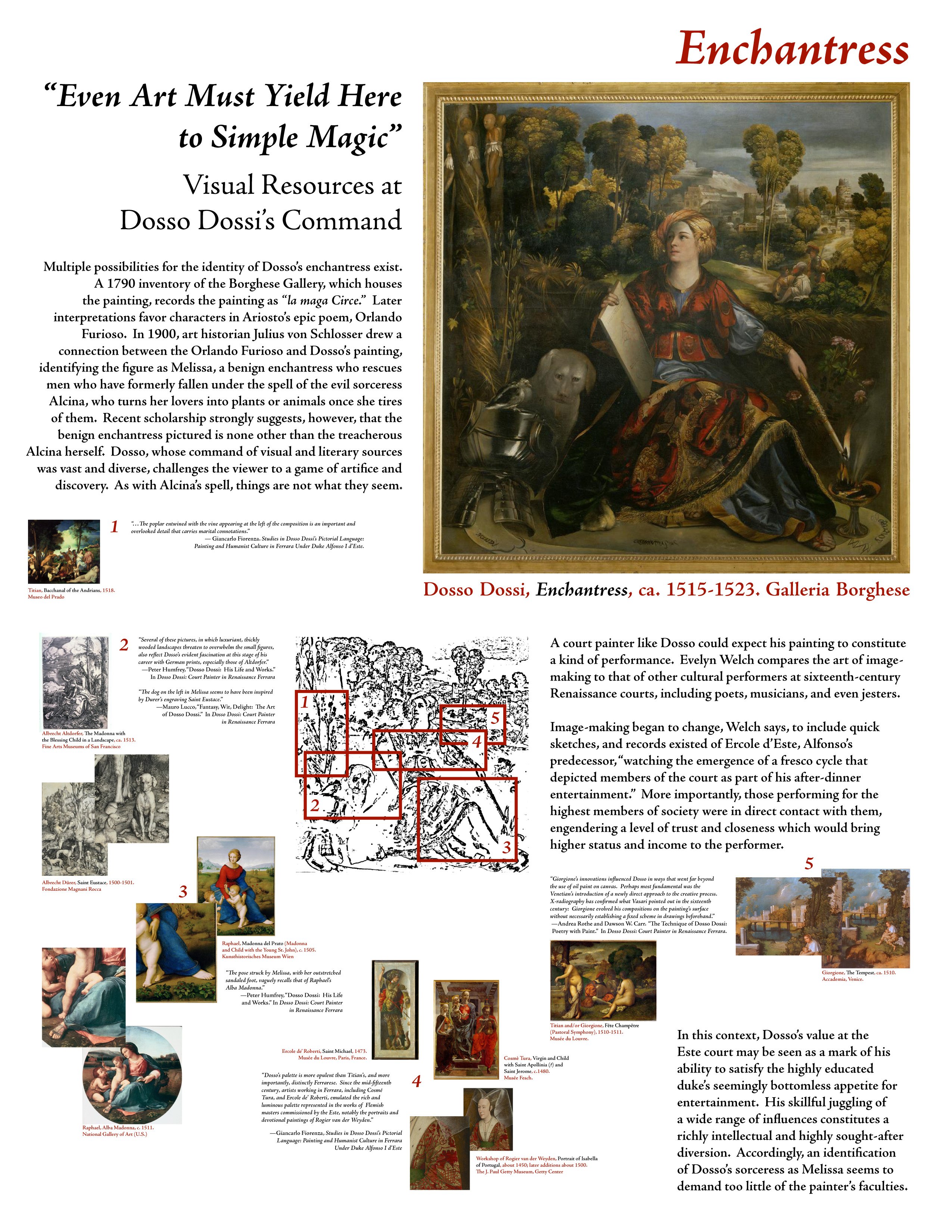
Dosso Dossi’s “Enchantress” analysis
17" x 22" poster (InDesign & Photoshop CS3)
May 2009 | client: Kristin Colyar
This is the only nonprofessional piece in my portfolio, aside from the projects on the Abstract page and the Expo ’74 plan rendering below. My pal Kristin was then a student at the University of Washington, studying to become an Art Historian/Archivist; she contacted me one afternoon in a bit of a dither because she needed to present a small poster for one of her classes the next day showing the status and nature of her current study (an analysis of Dossi’s painting with an eye to elements he may have unintentionally echoed or intentionally borrowed from other paintings of the time). Naturally I offered to take care of the layout part if she’d supply me with the text and images, and she did so as I was making dinner that night. A few hours later this was the result, and we were both quite happy with it.
Its major constraint was due to uncertainty about what printers would be available to her the next morning—while a proper poster of this would have been lovely to design, we agreed to play it safe in case the only printer available to her could print no larger than 11" x 17" pages; but her professor’s specifications required that the poster be at least 15" x 20", in portrait orientation. So I designed it to be printed on two 11" x 17" sheets which would then be butted up against each other and the pair then mounted on black posterboard. It’s a pity we didn’t have more time for review and refinement of this, such as ideally the following day, but I think we did pretty well in a pinch.
The process of this design was similarly constrained by the circumstances, but I took a triage approach to it: having already decided on the layout size as described above, I placed all provided text and images around the pasteboard, in related groups for the five illustration comparisons, and read the text to determine what she was wanting to communicate, which was that this one painting contains many elements which appear to be familiar from other paintings. The assignment specifications said the main painting had to be shown in full, and in order for her comparisons to be seen I knew the main painting would have to be as large as possible…but there’s not a lot of space available for all that on a single 17" x 22" page. So, with museum displays and art books in mind, I created a small linework version of the painting to use as a key (or image map, as Kristin immediately referred to it) on which I could superimpose zoom-area rectangles—something I couldn’t do to the main painting image without ruining it and robbing it of its own overall quality. Then it was just a matter of cramming all five comparison groups in the little space remaining…I wanted the primary analysis text to be large enough to read at a comfortable distance and the comparison illustrations to register there too, with the captions and supporting quotations being something you would look at more closely to explore.
On a more mundane level, I should note that I built it on a 7-column grid so I’d have a little hierarchy to guide me in sizing elements consistently and appropriately. But I didn’t stick to it religiously, wanting it to have a bit of a “paste-up” feel rather than any sense of rigidity.
p.s. She got a 4.0 on it. :^)
Puget Sound Action Agenda aerial illustrations
48" x 36" presentation boards (Illustrator & InDesign CS3)
2008 | client: Puget Sound Partnership (for Jones & Jones)
This was an interesting challenge for me because I am not much of an illustrator myself…usually I work with various graphic elements (photographs, logos, diagrams, text, etc.) and combine them in a design, and it is rare for me to build something of this nature. The starting point was the IAN (Integration and Application Network) Symbol Libraries Index, developed and made available by the University of Maryland Center for Environmental Science, consisting of a mixed bag of symbols and illustrations which could be used to create simple concept diagrams to demonstrate environmental impacts in various geographical settings; a couple of my Jones & Jones colleagues had learned about this symbol library and asked if I would try using them for a project or two in which they wanted to do just that, and I said I’d give it a shot.
The first pair of diagrams truly were fairly simplistic and relatively easy—generic upland and marine environments populated by various human and natural activities (industry, weather, recreation, wildlife passage) which would have some environmental effect or impact worth noting in the context of this particular project (I believe it was originally for NOAA). Pretty easy stuff—the digital equivalent of a flannel storyboard, as I remarked at the time, as you just choose a representative base and slap relevant icons onto it where they can combine to get a few basic points across (e.g., industrial locations generally have some polluting output into nearby rivers, estuaries are needed as habitats for various animal species to propogate, expansion of cities cuts into wildlife realms, recreational activities both benefit from and potentially impact natural settings, the building of roads tends to impede wildlife passage, etc.). And they were well-enough received that the Puget Sound Partnership asked us to expand the scope somewhat to illustrate their analysis of Puget Sound…ALL of it. Over several months, that request snowballed from producing loose stylized generic/sample landscapes to creating cartoony aerial simulations of the entire Puget Sound coastline and adjacent watersheds…representing seven “action areas” in all, from Neah Bay at the mouth of the Strait of Juan de Fuca to Boundary Bay at the border with Canada, plus a Sound-wide overview to put it all in perspective. It went from showing clumps of houses and buildings placed here and there (to indicate human/city presence) to having those clumps be appropriately located for every major city around the Sound, with all relevant highways connecting them. I mean, it BALLOONED. And when it did, I had to develop new techniques to construct each simulated aerial view, working with lots of feedback from my colleague Kari Stiles to stretch and warp the views as needed to show just enough context and focus individually appropriate for each of the “action areas”—there was no one Right Look…each one required a different aspect of emphasis and consequently a slightly “personalized” look.
This went on for months, ahead of local public meetings throughout the seven “action areas” to discuss findings and concerns with residents, and in the end Kari wrapped up the final boards herself with PSP, populating them with a bewildering array of the aforementioned symbols beyond the bases we’d established. There is a LOT of information on these boards—too much, really, as they strive to serve too many purposes all at once—so the visual impression is not aesthetically pleasing; however, the base work is surprisingly solid for the most part (although I still feel terrible about having to strrrrrretch about 20 miles of northern Whatcom County across what appears to be 60 miles of landscape, to cite an example of the warping this kind of illustration entailed). And I learned a LOT in the process—the names and runs of all significant rivers in the entire Puget Sound watershed, the locations of all of Washington’s lighthouses, the region’s freeway network (I don’t drive, so this was interesting in an abstract way), the locations of all fish hatcheries around Puget Sound, local whale migration paths, etc. The funniest one to do was that depicting Seattle, as I covered its foreground with houses but got feedback from the client that they wanted even MORE buildings crammed in there; I’d just moved from Seattle to Bellingham at the time, partly because of the increasing population density in Seattle, so it was easy to let myself go wild with their request and show the city as it FEELS at ground level. But then on top of that they wanted the view extended all the way south to Tacoma…which took a bit of re-working, as you might imagine, with the illustration’s focus completely shifted….
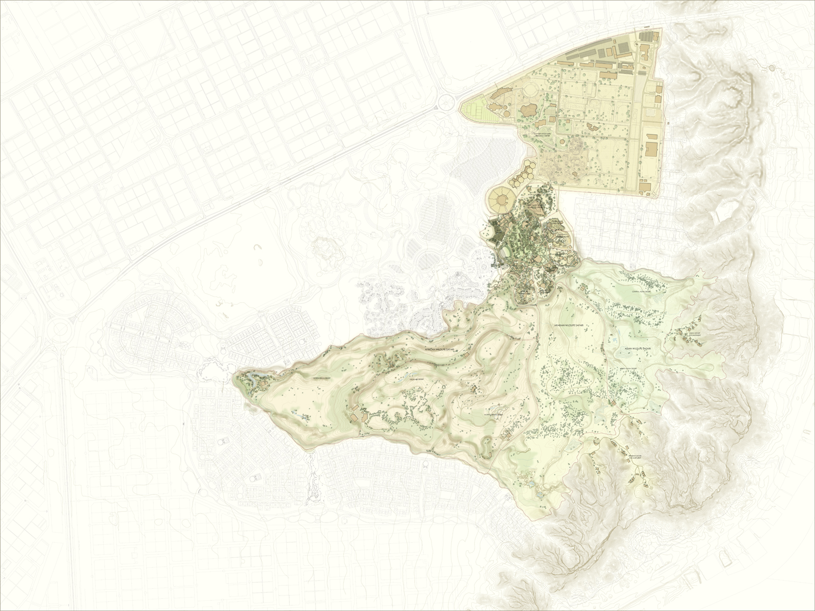
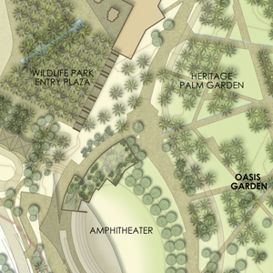
Al Ain Wildlife Park and Resort (متنزّه العين للحياة البرية) Site Plan Renderings
72" x 96" poster and 30" x 34" poster (Photoshop CS3)
early 2009 | client: EDSA (for Jones & Jones)
As the Al Ain team at J&J wrapped up their Design Development and Schematic Design phases for this enormous project, I was brought into play to generate new renderings of the plans, most of which were now coming from AutoCAD linework supplied by multiple project teams within the firm with me as the unifying endpoint. I’d done earlier versions of these at a few times throughout 2008 as the designs were refined, so by the time we got to the February deadlines we had the process pretty much down to a formulaic system—not an automatic or instantaneous one…there’s still some illustrative nuance involved and the files are truly huge so it takes time even in fast hands. The technique for these is the same as is elaborated on below on the Bergen County Zoo work and the Tropical America plan: AutoCAD-generated PDFs of like layers (roads, paths, rockwork, buildings, etc.) given white fills and layer effects, for the most part, resulting in smaller file sizes than would be the case if the color/texture effects were saved as pixel data, and the overall file saved as a TIF with LZW compression.
These files are, of course, enormous in terms of their dimensions as well as their digital footprint, so I’m not making full-size versions available here…the sample at right is still not full-size but gives a sense of the level of illustration achieved. Also, it’s worth noting that some of this work was subsequently refined while the core team was on site at meetings in the United Arab Emirates and I was implementing their update requests in the middle of the night in Bellingham to provide them with immediate, real-time turnaround and the Seattle office was all home asleep; sometimes being a night owl is a distinct benefit to one’s employers.
I also generated a series of building-elevation simulations for several structures of the proposed infrastructure for the project; samples can be viewed on my Design subpage.
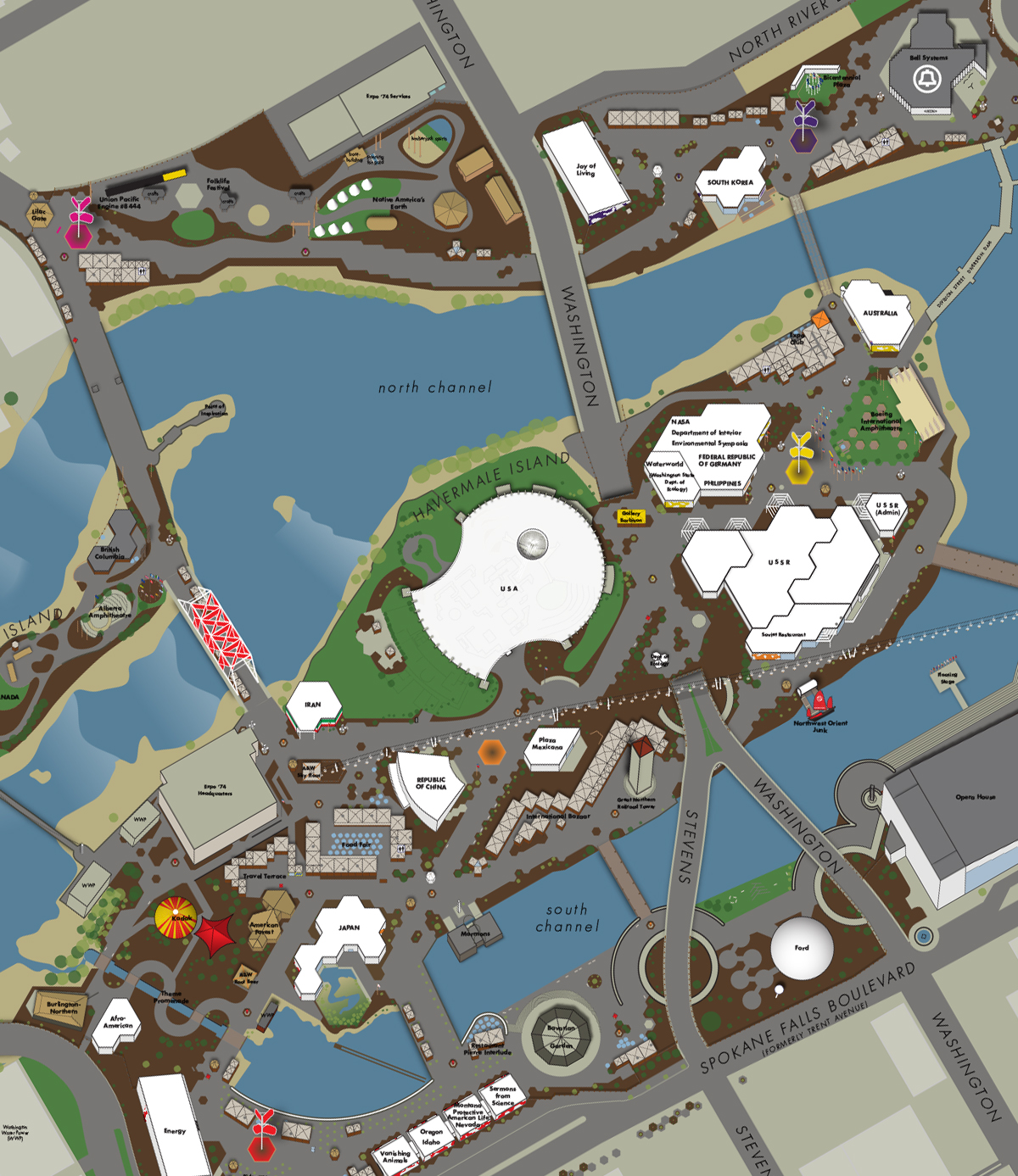
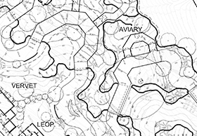
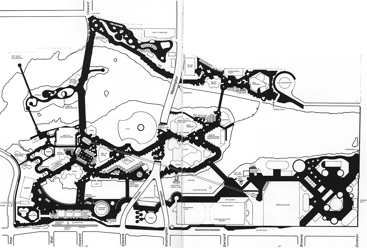
Expo ’74 Site Map Rendering
Adobe Illustrator CS6
This is a purely personal project for fun, but it does showcase some of my plan-rendering skills beyond the flat stuff shown above. I have a fascination for world’s fairs, especially their wayfinding design and the way they exist as a temporary transformation of a place into something completely different and wondrous. And Expo ’74, hosted by Spokane, continues to intrigue me the most. In 2011 I had the pleasure of meeting with Eric Grohe, who was one of the core team of three graphic designers and muralists who gave the fair its colorful and visually powerful look, with bold wayfinding elements such as the big canvas-and-steel “butterflies” which indicated the fair’s five color-coded zones, and he gave me some great insights into how it was achieved.
On a technical level, this plan was created by scanning the flat black-and-white plan printed in the fair’s official commemorative book by Dawn Bowers (see below), building it out in Illustrator, studying countless photographs and documents about the various elements to ensure that I got measurements right, colorizing everything to a heightened version of how it actually was, and then utilizing basic isometric-projection techniques I’d learned in a high-school Architectural Drawing class to produce a 3-D-simulation version of the site map.
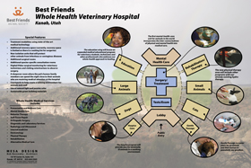
Best Friends Animal Society “Whole Health Veterinary Hospital” poster
36" x 24" full-bleed poster (Adobe InDesign CS2)
February–March 2008 | client: Mesa Design
A freelance project resulting from this online portfolio, produced with Bob Kaczowka of Mesa Design in the span of a few weeks. It was originally to be a pair of boards, but the scope of the needed presentation/publicity changed as the design was happening between Bob (in Utah) and myself (in Washington). I learned about Best Friends because of this job and thoroughly enjoyed the project both because of their intentions and values and because Bob was great to work with, really well-thought-out in all of his communications. Bob and I later collaborated on another board in early 2009 which involved me adding a lot of “photo dressing” to a set of architectural simulations he produced with SketchUp.

Posters for the Jones & Jones booth at the annual Association of Zoos & Aquariums convention
4 32.5" x 72" mounted posters (InDesign & Illustrator CS2)
September 2007 | client: Jones & Jones
This was a rush job: I had less than a week to create these boards, and only a little direction was provided. The latter was on the whole a good thing—I was asked to use my design for the previous year’s posters as a starting point but to emphasize a timeline running across all four boards (rather than being confined to a board of its own as I’d done that previous year). I was also given the phrase “Experience Driving Innovation” and pretty much carte blanche beyond that. So it was unfortunate that I got two steps into it and blanked on ideas for a couple of days.
When I got my second wind, things came together quickly: the challenge was to feature so many projects, each with at least one photograph, without having the result be a cluttered mess. I think I got it 75% right, doing as much as I could while being asked to make the images larger and even add some. Above all I wanted to create a massed visual which, seen from tens of feet away, would grab the passerby’s eye and compel them to come see what was being detailed amid all that swoopage. I was reasonably happy with the final result, and it was a surprise to receive the emphatically positive feedback and endorsement from the Principals involved.
Also, a technical note: this was the first poster-format project I produced entirely from my new home office in Bellingham, where I had moved a few months earlier. I didn’t see the final product until after the convention was over and the crew returned to Seattle.
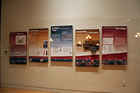
Interpretive Panels for the lobby of the Monterey Lofts
5 28" x 44" mounted posters (InDesign & Photoshop CS2)
Spring 2007 | client: The Seneca Group (for Jones & Jones)
The renovation of the old Monterey Hotel in Seattle’s Pioneer Square Historic District featured a number of “green building” and eco-friendly products, procedures, and concepts; the client wanted to educate guests of Monterey Lofts residents as to not merely features of this project but also the big picture: global warming as an ongoing result of human “progress,” for better or for worse. Project architect Jeremy Imhoff and I held many discussions to establish how to tell this story, and this was the result: five interpretive panels, three of them featuring specific “green” aspects of the renovation, two of them providing immediate context and history.
Running beneath these vertically staggered boards and uniting them with a shared horizontal “spine” is an ambitious timeline showing 120 years of milestones in environmental and local history. The invention of compounds and their later identification as causes of atmospheric ozone depletion are shown, as is the emergence of the environmental movement and resulting legislation in the U.S. and the U.K. to undo or at least slow the harm being done by human mismanagement of the planet. Nearly as much time was spent on the research for this timeline (and its exact placement of milestones relative to each other) as on the layout itself, but I’m such an info-junkie that I loved it.


Summer 2006 Recruitment Poster
11" x 17" full-bleed poster (Adobe InDesign CS2)
May–July 2006 | client: Big Brothers Big Sisters Serving King, Pierce, & Jefferson Counties
This was a freelance project, one of three parts of an ad campaign for BBBS’s local recruitment drive for Big Brothers (they have hundreds of Littles signed up hoping to get paired with Bigs); the other two parts—a postcard and a weekly-newspaper quarter-page ad—were developed from this design but incorporated strategic shifts appropriate to their targeted audiences.
What I’m showing here is my final draft, not necessarily what appeared in cafés and libraries and such around southern King County that summer: because I knew the Marketing Director at BBBS was sufficiently adept with InDesign and had the same version of the software as I’d used for the design, I delivered her not a final print-ready file but rather the InDesign files with all layers locked except for that of the photo, so she and her colleagues at Big Brothers Big Sisters were free to incorporate photos of local Big/Little brothers/sisters to replace the one I used, which was one from the national BBBS’s photo banks. The final printed version was very similar to this, but I prefer to show my design intact.
As I mentioned briefly earlier, this is but one part of an ad campaign: I started with the poster, which as the largest form is the one most open to scrutiny as well as the one which must grab the eye most immediately. When I met with the BBBS marketing leaders to begin the design process, I was given a good background of the situation, the goals, and the general tone of their Bigs recruitment effort, plus the “Be a mentor” (etc.) slogan (from a larger national BBBS campaign) and the tentatively established “Sometimes the biggest thing” (etc.) pitch. I asked for examples of what activities Bigs and Littles can do in their visits, and Pamela and Sara gave me two very engaging lists the nonprofit provides for Bigs as handy suggestion-prompters—one from the national headquarters and one specifically addressing local opportunities. These lists intrigued me, as they were full of excellent ways for people to spend time with each other in a child-like joyful celebration of anything from painting rocks to going rock-climbing, and I decided that I wanted to make the poster grab the eye first with an emotional and aesthetical immediacy which, if it did succeed in sparking curiosity and a closer look, would also contain the seeds for thoughts as to how the person viewing the poster could picture themselves being a Big for some child in need of that gently mentoring support.
Basically I treid to create something that would make me contemplate volunteering 8 hours of each month to be a positive influence in the life of a kid who’s hoping someone “older and wiser” will take them seriously and just spend a little time with them. I’m quite happy with the result, with that goal in mind.
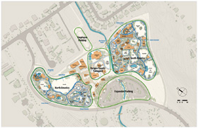
Bergen County Zoo Master Plan Concept
34" x 22" poster (plus 11" x 17" variations) (Photoshop CS2 & InDesign CS2)
June 2006 | client: Bergen County Zoological Park (for Jones & Jones)
If the Tropical America imagery below looks familiar, it’s because the processes and techniques developed during that project’s graphics-intensive phase served me well on this project and its very tight timeframe. I’m including the Bergen County work here partly to show that I’m still very much at work and partly to note the technical complexity.
This Site Plan had been very quietly simmering, on hold, for some months, and I’d done a mockup of an Executive Summary of the design work (before the design work had been done and before most of the narrative about the design had been written or even envisioned) four or five months earlier, when suddenly the project roared out of its dormancy and required some seriously quick turnaround for Final Draft status if not quite completion. In the span of essentially two days, I worked in tight tandem with J&J architect Wes Simmonds to produce this plan and a small array of related plans: Wes, working feverishly fast in AutoCAD, would generate black-and-white vector graphics of various elements of the overall design—new buildings, existing buildings, retained buildings, shotcrete elements, exhibit areas, water elements, paths, roads, adjacent residential areas, phasing strategies, coniferous trees, deciduous trees—as PDF files, and I would incorporate each of these in turn into one big Photoshop file in which I colorized the entire thing in its variously presented aspects—phasing, general thematic organization, specific exhibit-level floor plans, etc.
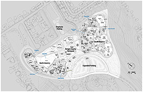
This mega-plan was only one part of a larger delivery that included the aforementioned Executive Summary (which I had to wrap up in a matter of hours under stressful circumstances), but I knew it was the content of this plan in its various forms that would seriously matter when the products were put to the zoo’s board a couple of days later, so Wes and I poured our energy into nailing it. The Photoshop file that resulted had 46 layers, not counting the 132 text layers for the various exhibit/building labels for various phases of the project (normally I would have done that part in InDesign, but time was short and I needed to generate products in one step, not two), and I was greatly aided by Photoshop’s then-new ability to nest layer folders, but what I want to emphasize is that only one set of those layers (the subregion labels) was actually colored: all other layers and elements of this file had either white or black content with Color Overlay layer effects applied.
Nikkei World War II Exclusion Memorial informational panels
2 34" x 54" panels + 1 17" x 27" panel (FreeHand 10)
June 2006 | client: City of Bainbridge Island and the World War II Nikkei Internment Memorial Committee (for Jones & Jones)
I’d been doing occasional piecemeal work for the Internment Memorial project over the last few years—presentation boards showing the initial design concepts and backstory/inspiration to the Bainbridge City Council and Memorial Committee, updating someone else’s brochure design for the Committee to focus on the project’s progress and direction, full-size mockups of what the “story wall” of the Memorial might look like, etc.—but this was the first time I got to see my work on the project realized.
The Timber Framers Guild constructed the traditional Japanese gate which will stand at the entrance to part of the Memorial, and the project team wanted to use that gate to publicize the project and get Bainbridge Islanders used to the idea of this memorial, so they asked Jones & Jones to produce some informational panels which could stand under the gate where it would temporarily reside just outside the entrance to the island’s Post Office. I was delighted to be allowed to design these, even though the graphic direction was established partly by the aforementioned brochure (I kept its “pieta” background, otherwise the typeface, palette, and overall feel were my own previously established style for the project), but upon reviewing a plan of where the panels would live I suggested that the gate would have a stronger impact if the signage were in the bit of landscaping east of it rather than directly framed by it.
I didn’t get over to Bainbridge Island to see the final product in person until many months after I’d done the design work, but when I finally got there I was very happy with how things turned out, even if one of the panels had soon been tagged with graffiti (a very telling social indicator when you’re dealing with a subject as locally sensitive and historically significant as this). It was also great to see a long-term embodiment of my own design almost entirely as I’d designed it: this project’s guiding Principal at Jones & Jones, and the rest of the team, were some of the few there who actually let me do the design work, and to see my design work actually survive intact to the printed result was gratifying.
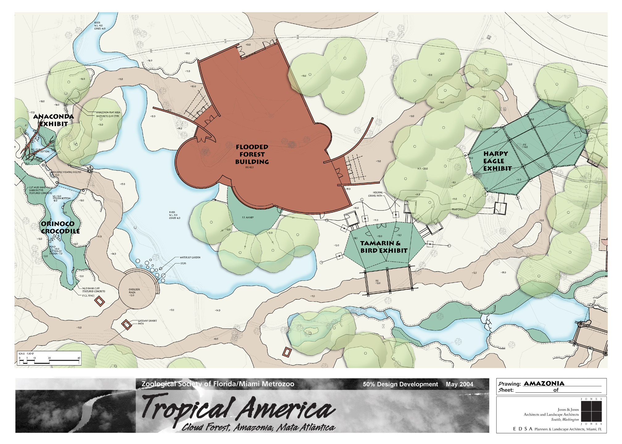
Tropical America maps and panels
42" x 30" panels (PageMaker 6.5)
May 2004 | client: Miami Metrozoo (for Jones & Jones)
Quite awhile after I had created the Tropical America project’s overall design scheme and produced the hefty Program Document in both print and HTML formats, I was brought back onto the project to refurbish the website to serve as a showcase of the team’s products; the team very soon also called on my Photoshop prowess to get many of their AutoCAD-produced plans colorized thematically for use on both presentation boards and the website, as I am quite swift in Photoshop. This illustration is a typical example of the results. (That title block, however, is not my design; I inherited it.)
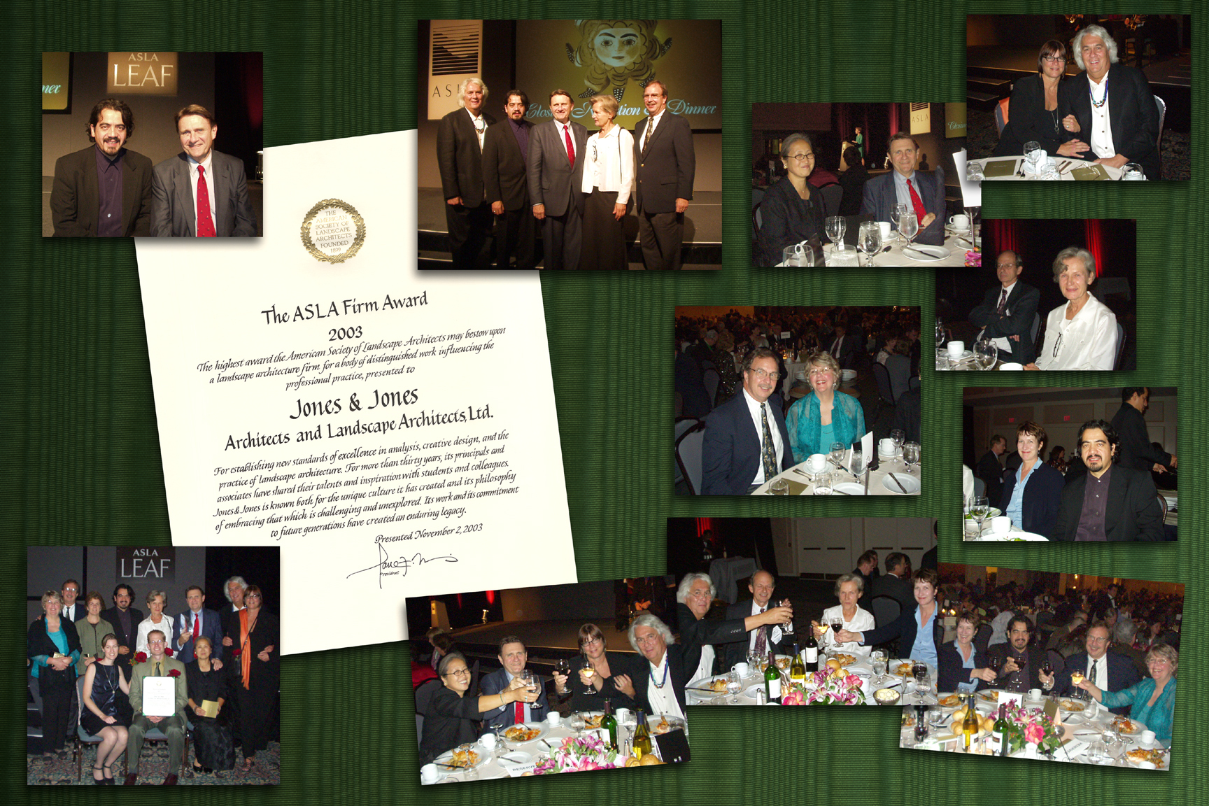
ASLA Award Commemoration
36" x 24" poster (Photoshop 7)
December 2003 | client: Jones & Jones Architects and Landscape Architects, Ltd
This was something I produced in-house on a whim to commemorate Jones & Jones receiving the American Society of Landscape Architects’ first annual ASLA Firm Award, November 2003. One of the Principals had given me some passable-quality photographs taken at the event and said “see if you can use these for anything;” this was the result, quite well-received, and later I was asked to adapt the design for both an online announcement of the award on the company’s website and a 5.25" x 4" hard-copy photograph for inclusion in the company’s holiday greeting card. I like the fact that I could make it work at all three scales and in all three contexts.
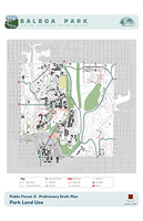
Balboa Park Land Use, Circulation, and Parking Study maps and panels
30" x 42" presentation boards + 11" x 17" handouts (Photoshop 7 & FreeHand 10)
October 2003 | client: City of San Diego Park & Recreation Department (for Jones & Jones)
Although the Jones & Jones Principal in charge of this project repeatedly changed the palette of these boards’ elements, making it impossible to give them any aesthetic finesse, usually they were at least presentable. I include mention of them here because of the complexity of the mapping and layering that was involved, especially as much of the base map had to be rebuilt in FreeHand to allow us to highlight specific buildings as they related to various aspects of the proposed land use and circulation scenarios.
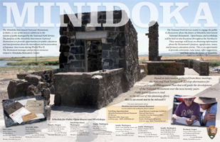
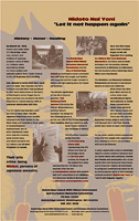
Minidoka Internment National Monument: General Management Plan public forums poster
11" x 17" poster (FreeHand 10)
October 2002 | client: National Park Service (for Jones & Jones)
This was actually a rush job, although it doesn’t look like it. The client urgently needed a small poster—something strong and “sexy” to be posted at libraries, community centers, etc., in cities throughout the Pacific Northwest to advertise the project’s imminent public forums and also to raise public awareness of efforts to redress the U.S. government’s terrible internment of Northwest residents of Japanese ancestry during World War II. Because of the tight timeframe, I was given the copious text and free rein to choose the photographs and layout to be used. It was approved on the first draft, almost exactly as you see it here; I made a couple of minor changes, and it was done.
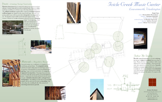
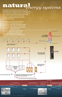
What Makes It Green 2002: Icicle Creek Music Center boards
36" x 22.5" presentation boards (FreeHand 8)
April 2002 | client: Jones & Jones
I worked with architect Mark Johnson to produce this pair of design showcase entry panels to feature both individual architectural details and conceptual text about the Icicle Creek Music Center project; the background’s angles are drawn from the lines of the building floor plan shown on both boards.
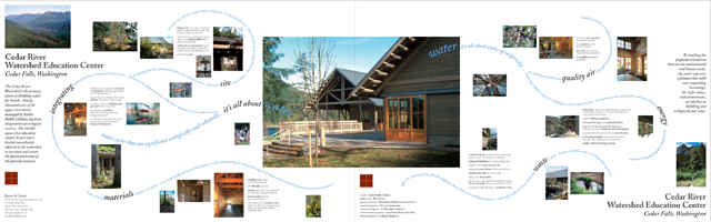
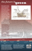
What Makes It Green 2002: Cedar River Watershed Education Center boards
36" x 22.5" presentation boards (FreeHand 8)
April 2002 | client: Jones & Jones
For this design showcase entry, architect Paul Olson and I collaborated closely to create a dynamic and unconventional design that would convey the interweaving concepts of the CRWEC’s background and role. As the competition stipulated that two 36" x 22.5" panels be submitted, sized to be reproduced later as facing pages in a 17" x 11" book, we decided to maximize the width available and make the panels flow together.
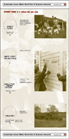
Bainbridge Island Nikkei World War II Exclusion Memorial presentation panels
24" x 48" presentation boards (FreeHand 8)
November 2001 | client: City of Bainbridge Island (for Jones & Jones)
Johnpaul Jones, one of Jones & Jones’s Principals, asked me to create some fairly simple but tall and narrow presentation posters specifically to make good use of the small but high-ceilinged room in City Hall where they were to be shown to the City Council. I kept the design light and sparse, not wishing to distract in any way from the seriousness of the subject matter.
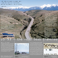
US 93: American Council of Engineering Companies (ACEC) 2001 National Awards entry
30" x 30" poster (FreeHand 8)
November 2001 | client: Skillings-Connolly Inc
This was designed specifically to be used by the engineering firm Skillings-Connolly (which had teamed with Jones & Jones on this challenging road design project) in this national engineering competition; they received the National Silver Award.
Jones & Jones: Leaders in Context-Sensitive Design
17" x 22" poster (Photoshop 5)
September 2001 | client: Jones & Jones
This promotional poster showcasing the range of Jones & Jones’s work in the field of road and transportation work appears largely as I designed it, although the landscape architect I worked with on it insisted on intensifying the drop-shadows under the text blocks, which I feel muddied the design somewhat; the posters were distributed at a Context-Sensitive Highway Design convention in Montana.
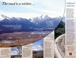
US 93: The Road Is a Visitor…
22" x 17" poster (Photoshop 5)
August 2001 | client: Jones & Jones Architects and Landscape Architects, Ltd
Given free rein with this design, provided only with some photographs and a lot of text, I had fun with it and enjoyed the end product very much; the posters were distributed at some convention in Montana, I don’t recall which, where it was a big hit and had to be reprinted. As Graphic Designer at this stage of the US 93 project I was one of the recipients of the ASLA Merit Award for Analysis & Planning later that year.
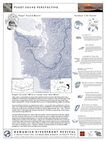
Duwamish Riverfront Revival
36" x 48" presentation boards (FreeHand)
July 2001 | client: Environmental Coalition of South Seattle (ECOSS) (for Jones & Jones)
These boards, six in all, were jointly designed by myself and architect Nate Cormier for some public forums at which the project team was pitching the concept of the Duwamish River’s resuscitation at the local level in Seattle’s Georgetown neighborhood. They were terribly content-heavy, but I feel we balanced that weight with some good design choices and judicious use of color and white space.
Comments © 2009 Mark Ellis Walker, except as noted, and no claim is made to source imagery noted.